Friday 30 March 2012

The poster put in a real life scenario.


The poster being advertised to the public.

I put the poster on a billboard digitally, from a photograph I took in the London underground. This helped see how the poster would look in everyday places. To curve the poster to fit the board I used the warp option. I feel it looks good in the real life situation, and jumps out effectively, getting the audience to look at the poster but also not being overly vibrant, not to clash with the scenes. I also like how the red in my poster is part of the british flag, and so matches the london underground sign, as well as the yellow text matching the london underground travel messages.

Making a poster for my film.


Making the poster.


First of all I added the picture I had already edited of Luke and Matt from the character profiles to a a4 sized layer, which I made black using the paintbrush tool. I chose these two images as they were both powerfully staring at the camera and put them on opposite sides of the poster, Matt being raised slightly to show his higher status. I then chose a new image of me as the other had my hand by my face and so would not have been an effective close up. I put the image on 25% opacity so that it would show Matt and Luke's faces interestingly behind the detail of my hair. This achieved the multi-image overlayed style of film noir posters in a new and effective way.

For the next step I added the text and our logo. For the title I used the warped text option on horizontal arc, using one for 'Le Mortel' and another for 'Liaison' to make it curve around the one above. This made an effect very authentic to the classic film noir titles. For the title, sirname and bottom credits I used 'Niagra Engraved' as it looked very prominent in capitals and with the engraved and block effect looked suited to the Film Noir time. For the other text, the first names and the caption, I used Edwardian Script, as it created a contrast to having all of the same text and was a formal and readable italic font. Having it in lower case also made it contrast further from the capitaled text.

With colour I stuck to red, white and yellow after I decided during the research, red being the most dominant colour perfect for the title, and matching with the production logo, and having the sirnames in white to contrast from the first names above. I also made the first name text smaller than the sirname text, and positioned it nicely directly on top of the sirnames, making them look more delicate. I chose the caption to be in yellow to help that stand out too, choosing the rule of three for the caption to make it more snappy, and an exclamation mark to help make the poster exciting.

For my final step I added 'fx' tools to my text. With the title I chose 'outer glow' giving it a strong white outline and making it look more appealing. I also used an outer glow for the caption, but in black instead to stand out from Matt's white shirt, and also used drop shadow. For the sirname text I used the bevel and emboss tool, on the inner bevel option. this gave a slight 3D effect to the text and made it stand out more. With the first name text I used an inner shadow on 70%, this helped add tone to the text and stop any harsh lines.


My  Finished Film Noir poster.


Representation in the poster.

In my poster I used black and white to keep with the style of the film, and it gave it a 50's feel. The femme fatale is a main part of the image, placed centrally deliberately to stand out and dominate the image, the image of her being larger than the others, and being inbetween the two male protagonists to show the conflict between them, and how its all because of her. The way her head is tilted helps show her seductive, twisted nature. The lighting in the image is also an important part in showing the representations, the Adrianna and Bones both having a shadowed side, but Barnaby being in the light, his other half hidden by Adrianna, showing her control over him. Also, with the eye contact, although all three are looking at the camera, each look different, showing their personalities. Bones has a spark of evil in his eye, a look of revenge, and Adrianna, wide eyed, looks curious and also hiding something. Barnaby however has a pure look, showing he was troubled and sad.

Analysing existing Film Noir Posters

Classic Film Noir Posters.


Before making a poster for our film, I needed to study the classic Film Noir posters to get an idea on their style, and what would be included. Below are three examples; "Born to kill", "The killers" and "The Lodger". First of all, all of the posters were drawn, but because they wanted to show the poster in colour as in that time (40's-50's) there was only black and white film. However as in modern day all posters are in colour, I will make the pictures in the poster black and white to help show the classic film noir style contrasting from current films. I will also use photographs and photoshop instead of drawing the image, to give a modern touch to the style.

Next, I noticed that the colour scheme was very similar in most posters, with black, red, white and yellow featuring most often. These colours work well for the theme, black being dark, white contrasting from the dark, red to resemble blood and passion, and yellow to represent danger. I will therefore stick to using this colour scheme for my poster. With the pictures in the poster, alot of them use multiple different images and combine them, overlapping them. I will do this on my poster too, and it will be alot easier to achievethe effect on photoshop, using the different layers and the erase tool. On the poster they also always show the male main character, the protagonist, and the femme fatale. There is also usually another man in the poster who is closely involved in the story.

When looking at the text, the main title is often diagonal or waved, to give it more emphasis. There are effects I can use on Photoshop to do this. The main title is also usually in captials, to give further emphasis. A lot of the text is also outlined in another colour tomake it stand out more. As well as formal, capital fonts, italic fonts are common in the Film Noir posters. I will make sure to imclude both in my poster, which will help give it some variation. The text on the poster includes the title, cast and producers logo, and also often has a little catchphrase/summary like the top two posters. I like the "Tense! Taut! Terrific!" one, as it uses multiple literary techniques; the rule of three - listing three things, using alliteration of the 'T' and using exclamatories to make it sound more exciting. I will add a mini catchphrase/summary to my poster to help make it look more authentic.


Tuesday 27 March 2012

Film Noir Character Photoshoot - Profiles

Profiles

Bones Goodwin 


Barnaby Frisco


Adrianna Frisco


Choosing the Images


For the photoshoot we used a professional studio with lights, and decided to use a black background to set the dark themes. Above are the final images for each character that I found the best and chose to edit, and to the right are some of the contact sheets of the photographs taken which I chose from.

First of all I chose the Bones Goodwin image as I found the image was very effective being dead central, the character staring straight at the camera. I feel it also captured his personality and story well, with half his face in shadow to show he has a dark side, and the serious look in his face shows he is vengeful.

For Barnaby Frisco I chose two images as I felt they both were effective in different ways; I like how in the first image the way he is looking to the side, out to the distance and his face in the light, helps show he is troubled. The other, with Barnaby looking straight at the camera was equally interesting, and I like the way he is to the side of the frame. Seeing his expression directly in front of the camera shows strongly his anxiety.

For Adrianna, I liked this image as it showed her feisty nature having the necklace by her lip, and the direct eye contact is powerful, the eyes being defined with eyeliner. The arm helps lead the eyes to the face, and the shadow created by it shows theres more to her, with a darkness around her. The way her head is tilted slightly to the side makes her seem a curious character too.


Editing the images

To make the final images I edited them on Photoshop CS3. First of all with each image I made them black and white, to help set the Film Noir tone. I then used a high pass filter on hard light blending mode to boost the images lines and make it more defined. I then added a curve layer, making it darker for Bones Goodwin to give more shadows, and lighter for Barnaby Frisco to give more highlights, to give contrast between the characters. On the Adrianna image I also turned up the brightness on a layer mask to just the necklace, to help it be more noticeable.

Thursday 15 March 2012

Deciding our Filming Roles

As a group we needed to organise who would do what role in making our film. Therefore we allocated roles equally to members on their strengths, but also being a small and close group we all got involved in every role.

All Of Us
  • Writers: coming up with the storyline for our film.
  • Casting: deciding who would be in our film.
  • Actors: performing in our film.


Emilie Cherry
  • Screenplay: making our storyline into a script.
  • Assistant Film Editor: helping to edit the film.
  • Location Scout: helping to find locations that we can film.
  • Wardrobe Supervisor: deciding the costumes.


Matt Williams
  • Cinematography: making sure the shots looked good as well as filming.
  • Film Editing: the main editor of the film.
  • Music Supervisor: finding the music for our film.


Luke Jones
  • Main Actor
  • Assistant Film Editor: helping to edit the film.
  • Location Scout: helping to find locations that we can film.

Raya Renney
  • Secondary Cinematography: making sure the shots looked good as well as filming.
  • Assistant Film Editor: helping to edit the film.
  • Property Assistant: finding suitable props.
  • Location Scout: helping to find locations that we can film.

Saturday 10 March 2012

Script for Le Mortel Liaison

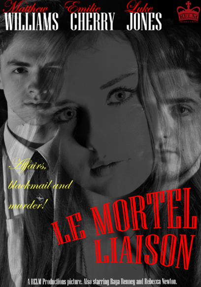
Film Noir script for ‘Le Mortel Liaison’
PROLOGUE
<echo, reverb sounds>
MATT
‘’I cant help it, I love her!’’
LUKE
‘’Not like I do!’’
(gun shot)

TITLE SEQUENCING – (Exterior shots of area)

~~~~~
ACT 1
~~~~~
SCENE 1

Montage of Luke getting ready.                               Scene directions-
-          Mirror – steamed up, clearing.                   Cutting between Luke and Emilie getting ready.   
-          Cutting face with shaver.
-          Pouring water, spilling.
-          Burning toast.

Emilie is getting ready. Focus on pendant on the table.  Mirror shot of her putting it on. Luke approaches from behind. Focus on feet, low angle shot. 
LUKE
(into mirror) ‘’I’m going.’’
EMILIE
‘’Nervous?’’
LUKE
‘’Why should I be?’’
EMILIE
 (sigh) ‘’Just be careful.’’
LUKE
(at doorway) ‘’I always am.’’ (closes door and gets into car)
ANONYMOUS VOICE OVER
‘’it was detective Frisco’s first day back. He had been on leave for… personal reasons. “
<Montage during voiceover and then music >
·         in the car; shots inside and front of car
·         walking into station/office - shot from behind, tracking forward
·         through corridor
·         shot opening door, light behind him, turning lights on.

SCENE 2
<Music cuts/fades out> sits at desk, and gets adjusted/climatised to room.
Raya knocks on door, see him turning around and then point of view seeing Raya by door.

RAYA

“How are you coping without him, Frisco?”

LUKE

“not a day goes by when I don’t think of him”

RAYA

 “Mm, it can’t be easy/it must be hard”

LUKE

 “It doesn’t get any easier”

RAYA

 “They still haven’t caught him…”

LUKE

 “No…not yet” *angered*
===
“*thump on desk* We’ll catch him, don’t you worry” <looks at photo of Goodwin>

*PHONE RINGING*


LUKE

(into phone) “Frisco (pause)     I’m on it.”


SCENE 3
--- Transition cut to murder scene: tunnel, including establishing shots of the industrial area, leading to tunnel. ---
Detective Frisco goes up to body, kneels down by it. <Over the shoulder shot>.
Inspects body, goes to hand, note rolls out of hand. <close up on hand>
<close up slow motion of necklace falling out of the note as he opens it> <reaction shot>
Frisco picks up the necklace and inspects it.
<close up of necklace in Frisco’s hand.>
< Mid range shot of Frisco> standing still, holding the necklace.
Noise at end of tunnel, footsteps. <long shot of tunnel, darkness>
LUKE
 <shouting> “Who’s there?”
Noise of footsteps running away/ figure in darkness
Luke runs to end of tunnel, gives up. <close up of reaction>

~~~~~~~~~~~~
ACT 2
~~~~~~~~~~~~
SCENE 1
---Back to office----
<high angle shot> Frisco at desk, deep in thought.
·         Note and necklace at desk, cigar in ashtray, smoking.
<time lapse shot> clock changing time, static/fade change. Showing Frisco in same place.
<Quick shots> now showing frustration, slides papers off desk, shouting.
<point of view shot> picture of them in church, showing hand picking up photo.
<close up on face>
LUKE
 *murmurs* “the church”.

SCENE 2
<Establishing shots of church, low angle>
Frisco running onto scene.  Breathless, unsure of where to go. Looks around and moves to decided location (bell tower or church interior)
Finds wife tied up.
LUKE
 “Are you okay? What happened? Who did this?” No answer from Emilie, just head down.
Matt comes up from behind and knocks him out. <Blurry background then Black out.>
<Close up of head on floor>
<Disorientated shots, ceiling etc> Passes out again.
Bones is above Frisco, watching him. <Start out of focus, moves into focus>
MATT
 “Hello old friend. I’ve seen you in better states.  (ad lib: explains how he’s still alive, his wife’s gone behind his back and the plan to get him here)
<close up of Luke clenching fist and getting angry>
They both start to fight, lots of quick shots of punches etc.
Luke strangles Matt, then shot from behind, Luke slumps off.
Shot of Emilie with gun.

END CREDITS

Wednesday 7 March 2012

Filming Schedule

DATE
TIME
PLANNED TO DO
ACHIEVED
Thursday 23rd February
9am – 12pm
Both office scenes
Both office scenes.
Sunday 26th February
4pm - 7pm
Bedroom Scene and church scene
Bedroom Scene. Church scene postponed as raining.
Tuesday 28th February
11am - 1pm
Tunnel Murder Scene
Tunnel murder scene.
Tuesday 28th February
5pm - 7pm
Intro and Church scene
Intro. Church scene postponed as got too dark to film.
Thursday 1st March
9am - 12pm
Church scene
Church scene.
Monday 5th March
2pm - 3pm
Voiceover for introduction and going to work scene.
Both voiceovers.


For filming we mainly used periods where we would be in Media Studies as that’s when everyone would definitely be available. However that was not enough time and we needed spare slots, so we arranged times we could all do out of school as well. We originally planned to have all of the filming done (not including sound voiceovers) by Tuesday 28th February, but because of the multiple difficulties with the church scene, first of all heavy, continuous rain where we couldn’t risk damaging equipment, and the second attempt when we started filming but it got too dark earlier than we expected. We used our spare slot Thursday 1st March to film the church scene, but in case it rained again instead of using the graveyard as we originally planned we used the inside of the church after getting permission from Father Andrew. This ended up being a much better option as the scene looked very powerful with the tall arches and stained glass windows.