Making the poster.
First of all I added the picture I had already edited of Luke and Matt from the character profiles to a a4 sized layer, which I made black using the paintbrush tool. I chose these two images as they were both powerfully staring at the camera and put them on opposite sides of the poster, Matt being raised slightly to show his higher status. I then chose a new image of me as the other had my hand by my face and so would not have been an effective close up. I put the image on 25% opacity so that it would show Matt and Luke's faces interestingly behind the detail of my hair. This achieved the multi-image overlayed style of film noir posters in a new and effective way.
For the next step I added the text and our logo. For the title I used the warped text option on horizontal arc, using one for 'Le Mortel' and another for 'Liaison' to make it curve around the one above. This made an effect very authentic to the classic film noir titles. For the title, sirname and bottom credits I used 'Niagra Engraved' as it looked very prominent in capitals and with the engraved and block effect looked suited to the Film Noir time. For the other text, the first names and the caption, I used Edwardian Script, as it created a contrast to having all of the same text and was a formal and readable italic font. Having it in lower case also made it contrast further from the capitaled text.
With colour I stuck to red, white and yellow after I decided during the research, red being the most dominant colour perfect for the title, and matching with the production logo, and having the sirnames in white to contrast from the first names above. I also made the first name text smaller than the sirname text, and positioned it nicely directly on top of the sirnames, making them look more delicate. I chose the caption to be in yellow to help that stand out too, choosing the rule of three for the caption to make it more snappy, and an exclamation mark to help make the poster exciting.
For my final step I added 'fx' tools to my text. With the title I chose 'outer glow' giving it a strong white outline and making it look more appealing. I also used an outer glow for the caption, but in black instead to stand out from Matt's white shirt, and also used drop shadow. For the sirname text I used the bevel and emboss tool, on the inner bevel option. this gave a slight 3D effect to the text and made it stand out more. With the first name text I used an inner shadow on 70%, this helped add tone to the text and stop any harsh lines.


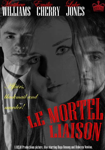
My Finished Film Noir poster.

Representation in the poster.
In my poster I used black and white to keep with the style of the film, and it gave it a 50's feel. The femme fatale is a main part of the image, placed centrally deliberately to stand out and dominate the image, the image of her being larger than the others, and being inbetween the two male protagonists to show the conflict between them, and how its all because of her. The way her head is tilted helps show her seductive, twisted nature. The lighting in the image is also an important part in showing the representations, the Adrianna and Bones both having a shadowed side, but Barnaby being in the light, his other half hidden by Adrianna, showing her control over him. Also, with the eye contact, although all three are looking at the camera, each look different, showing their personalities. Bones has a spark of evil in his eye, a look of revenge, and Adrianna, wide eyed, looks curious and also hiding something. Barnaby however has a pure look, showing he was troubled and sad.
No comments:
Post a Comment