In what ways does your media product use, develop or challenge forms and conventions of real media products?
In order to achieve the most realistic film possible a lot of research went in to existing media products in film noir. We learnt of the history of Film Noir, the typical conventions and characters, and then watched films of the traditional Film Noir Genre, like the Big Sleep and Double Indemnity, and films of the more modern Neo Noir genre, Brick and LA Confidential. While watching the films and after we analysed what parts of the films were effective and what conventions they used of the genre. Doing this helped make me clear on what should be in our film; what we should take from the classics, what conventions to keep, and what to challenge.
In order to achieve the most realistic film possible a lot of research went in to existing media products in film noir. We learnt of the history of Film Noir, the typical conventions and characters, and then watched films of the traditional Film Noir Genre, like the Big Sleep and Double Indemnity, and films of the more modern Neo Noir genre, Brick and LA Confidential. While watching the films and after we analysed what parts of the films were effective and what conventions they used of the genre. Doing this helped make me clear on what should be in our film; what we should take from the classics, what conventions to keep, and what to challenge.
First of all we decided for our film to be in black and white to fit the classic Film Noir style, as Film Noir’s were most popular around the 40-50’s, where films were only black and white. The black and white also helped make the scenes fit the dark convention, and looked more effective than in colour as all colours of the greyscale complimented. We also chose to have the classic characters of a main male protagonist, who has a troubled past, and a femme fatale who is seductive and twisted. However to challenge the conventions, instead of the character meeting the femme fatale, she is already his wife, but she leads him astray with the help of another man.
 The storyline of our film was greatly thought out to include conventions of classic Noir but also have unique twists. We made it a dark story, including affairs, violence and murders, as well as having a mystery element to it with the main character being a detective, solving a crime. Having modern techniques of flashbacks, as well as the twist of the wife becoming the femme fatale by shooting her husband in the end, helps make it original. Classic Noir is also American, but we challenged the conventions by choosing to stay in English accents, as we would be filming in England so we wanted it to be realistic, and also it helps create a new kind of Film Noir. The church scene is an example of a typically English looking place, but still it suited the genre well, the stained glass windows creating interesting shadows, and the tall building being a big, ominous space.

For our other locations, we chose conventional scenes, for example the office scene; many film noirs protagonists have an office, and we used lamps and other props to help make this a realistic scene. We also used urban settings, like the tunnel murder scene. This helped make it look authentic, but also with the graffiti on tunnel gave it a modern twist. And in the bedroom scene, we had a convention used often in film noir; a mirror. This distorting object effectively showed the femme fatale at the front and the protagonist eerily looming behind. Around the mirror we also carefully arranged for there to be makeup, perfume and picture frames, to show it was dominated by the femme fatale.

 With camera shots and angles many in Film Noir were static, and so we mainly stuck to that, but for when he walks up to the church we used a tracking shot, which gave the climax of the film more suspense, following the character in. Film Noir’s also included a variety of low and high angles, and close up and long shots. I feel we have used a good variety of those. With lighting, using a variety of single source lamps, outside lighting and main lighting I feel we effectively created the dark feeling of Noir, with shadows and darkness. Costumes were also important, and we mainly kept to conventions with the men in suits and the femme fatale wearing jewellery and makeup, including red lipstick, however we chose for the femme fatale to be in a jumpsuit instead of a dress to give a modern twist to her, but I feel it was just as effective, being long, black and elegant.
How effective is the combination of your main product and ancillary texts?
I am very happy with all of my products, and feel they link in well with each other, the poster advertising the film accurately and effectively, and the review telling an accurate plot and verdict.
For the poster, I feel it fits in with the film, first of all the pictures being in black and white helping show that the film itself will be. I noticed some other posters made by the group were in colour which could be misleading to the viewer of the poster. The photographs themselves were chosen to show most accurate image of the characters possible; I chose photographs where lighting was interesting, Bones in the shadows and Barnaby more in the light helps show the different personalities, who is the good and bad guy in the film. Also choosing Adrianna with a slight head tilt shows her seductive, twisted personality. We made sure we took the photographs of the characters with the same costumes they would be wearing in the film, to keep continuity.
For the film review, as it was an online style review it was simpler than the poster, but I kept continuity by using the same colour scheme as the poster, only using black, white, greyscale, red and yellow; using a white background and black text to keep with usual web pages, but adding yellow to the stars. I put the poster to the side of the review, to help link them together more and advertise further to the audience. For the film review I also added a still from the actual film of Luke walking into the church. This was also in black and white, and the way Luke is looking up to the left actually leads the reader’s eye to the poster. The picture helped give an insight to the movie but without giving too much away, which combined the film and the review further.
Overall I am very pleased with all three of my products, each fitting the conventions of existing Film Noir movies, posters and film reviews, making them all link but also each having their own difference giving our film many different interesting aspects.
What have you learned from your audience feedback?
The audience giving feedback was mixed, some media students and so knowing a lot more about Film Noir, and some not. This helped see how a range of people would feel watching the film. Interestingly a lot of the comments were similar, media students or not. Looking at the feedback we received for our film, the majority of the feedback was positive, learning that putting the film in classic film noir instead of neo noir colour was a good decision having 3 of the 6 mentioning this for example; “it worked well in black and white”. Sound was also mentioned by 4 of the 6, all being positive: “the music fitted in perfectly with the scenes” which I was pleased to see. It made spending the amount of time we did deciding the perfect music for each scene worthwhile. Other than the background music, the voiceover sound was mentioned “I thought the voice over was a nice addition that helped the storyline.” This equally made spending that little extra time going into a recording studio recording those parts worthwhile.
As well as the positives, we took the negatives on board. These perhaps are the most important parts to the feedback, to know what could be better. Having some time after the videos were first shown, we tried to put some of the criticisms to action. Because of Beth’s comment “maybe needs to be a bit darker to fit in with film noir” we edited parts of our film further, using the brightness/contrast tool to make the film darker. This improved our final film. We also tried to work on the comment “I found a few of the shot transitions did not flow completely, giving black flashes.” however we did not manage to get rid of these flashes as it was a technical issue which would possibly involve reediting all of the different parts together again, which unfortunately we did not have time to do.
Therefore I have learned that if I was to do it again, I would try to receive feedback more early on in case of major changes needed to the film. I have also learned that all of the preparation before making the film, choosing costume, scenes, storyline etc was vital and needed as much time as we had spent on it, to help it be a successful film in the end, which was proven by the positive feedback, which mentioned the storyline, locations etc: “the storyline is inticing” and “Mise en scene was well planned in advance”. After getting feedback and completing the final film, I asked a family member to watch the film and got feedback from them “I particularly liked the choice of locations for the scenes, which made the story more believable. I thought the way photography was phased to show a past event, i.e. putting on the pendant in the mirror, was very effective. I found the shot of the hand reaching for the gun on the church floor brought an element of surprise to the film.” This comment having no negatives was good, and I asked them if they noticed the black flashes afterwards and they hadn’t, so fortunately it was not a major flaw, just a slight error that you only notice if you are really concentrating. Personally I feel that the flashes actually help give the imperfect, old fashioned style cinema feel to the piece, so perhaps it’s not a negative after all.
How did you use media technologies in the construction and research, planning and evaluation stages?
Media Technologies used for our Film Noir project:
1. Microsoft Word
2. Microsoft Publisher
3. Photography Studio (Lighting)
4. Adobe Photoshop CS4
5. Sony Vegas 9 Pro
6. Canon EOS 500D camera
Microsoft Word

I used Microsoft word when designing my questionnaire about Film Noir for audience research. I chose word as it was a simple and professional way of making my questionnaire, also enabling me to print out multiple copies of the same page. I used helpful tools such as the ‘header’ option which made a professional title at the top of the questionnaire, and also used the ‘insert shapes’ tool on the ‘Format’ option, choosing rectangle, to make an effective tick box. This box was able to be copied and pasted multiple times for my questionnaire, being a very time saving tool. We also used Microsoft Word for designing and typing up the script/screenplay for our film. This was an effective program to use as editing the screenplay was very easy to do, simply being able to delete sections and write new parts anywhere without it looking scruffy as it would by hand. There were also the handy tools we used like ‘bold’ and being able to choose fonts and sizes, and the paragraph tools where we chose centre to make it a realistic screenplay, as well as the spell check automatic function which underlined any misspellings in red, helping us make a professional script.
Microsoft publisher

 I used Microsoft Publisher to make my Film review, as it had type options like word but also more advanced design options, helping to make the desired layout as easily achieved as possible with its flexibility of allowing you to place text boxes and images anywhere on the page, being able to drag them and resize them. Having different sections to the review, like the details to the left, title at the top and plot and review to the right made that especially helpful. Other useful tools I used was the ‘auto shapes’ tool, where I got the star shapes and then was able to colour them by using the ‘format autoshape option and then the ‘fill’ option, choosing the colour I wanted from the palette. I also used the ‘line’ tool to make the black lines I used to separate the title and film details, using the format autoshape option again but this time changing the line options, making the line thicker by changing the ‘weight’ option.
Canon 500D camera, Photography studio (lighting) and Photoshop CS4
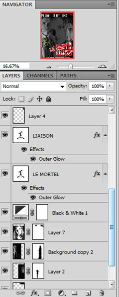
We used the video camera option on the Canon camera to film all of our film, but also used it to take pictures for the character profiles and the ancillary products; the poster and the review. For the character profiles and the pictures for the poster, we used the photography studio to take the pictures as it had professional lighting and backdrops which helped us achieve effective pictures. I then used Photoshop CS4 to edit the pictures, and put the poster together. Photoshop being an advanced program made it easy to edit the pictures, as although it is complicated having experience in Photography A level has made me used to the program. Photoshop includes useful features like the navigator, which lets you zoom in closely and target a specific part of the picture. It also allows you to put the different parts of the picture as individual layers, where you can make different ones visible/hidden and rearrange what layers go above others. This was needed for the poster as there were so many different parts to it, including the logo, photographs and text. I also made use of the many adjustment layer options, which increase contrast, make it black and white etc, and the ‘fx’ tool on the text which gave the outlines and shadows. For the review’s pictures I used the posters made on Photoshop, but also included a still from the movie which was captured by taking a photograph using the camera in-between filming, which then needed to be made black and white on Photoshop.
Sony Vegas 9 Pro
 We used Sony Vegas 9 Pro for the editing of our film as it is advanced and professional software, with many available editing options. A member of our team, Matt, had this software on their laptop, which allowed us to be able to edit at any time, instead of being restricted by using the editing software at school only available at limited times. Another advantage of this was that the member of our team had good knowledge of the software, and so we did not have to waste time getting used to it and trying to find out how to do things. Sony Vegas had a wide list of editing options, of which making the whole film into black and white was done quickly and hassle free. We also used the brightness/contrast editing option to increase the tone of the images, making them less dull and creating more shadow. There were also effective tools like the ‘glow’ effect, which was used during the flashback to help give it that past, dreamy feel. The way the program is set out having all of the video clips in a tab at the bottom, in a separate row to the sound, helped edit the video easily, being able to crop and move the video clips, which we needed to greatly edit down, and also move the sound to fit the right part of the video. Having a video preview screen at the top and effects options was also very handy, being able to preview the film instantly after making changes, and being able to make quick editing options.
No comments:
Post a Comment